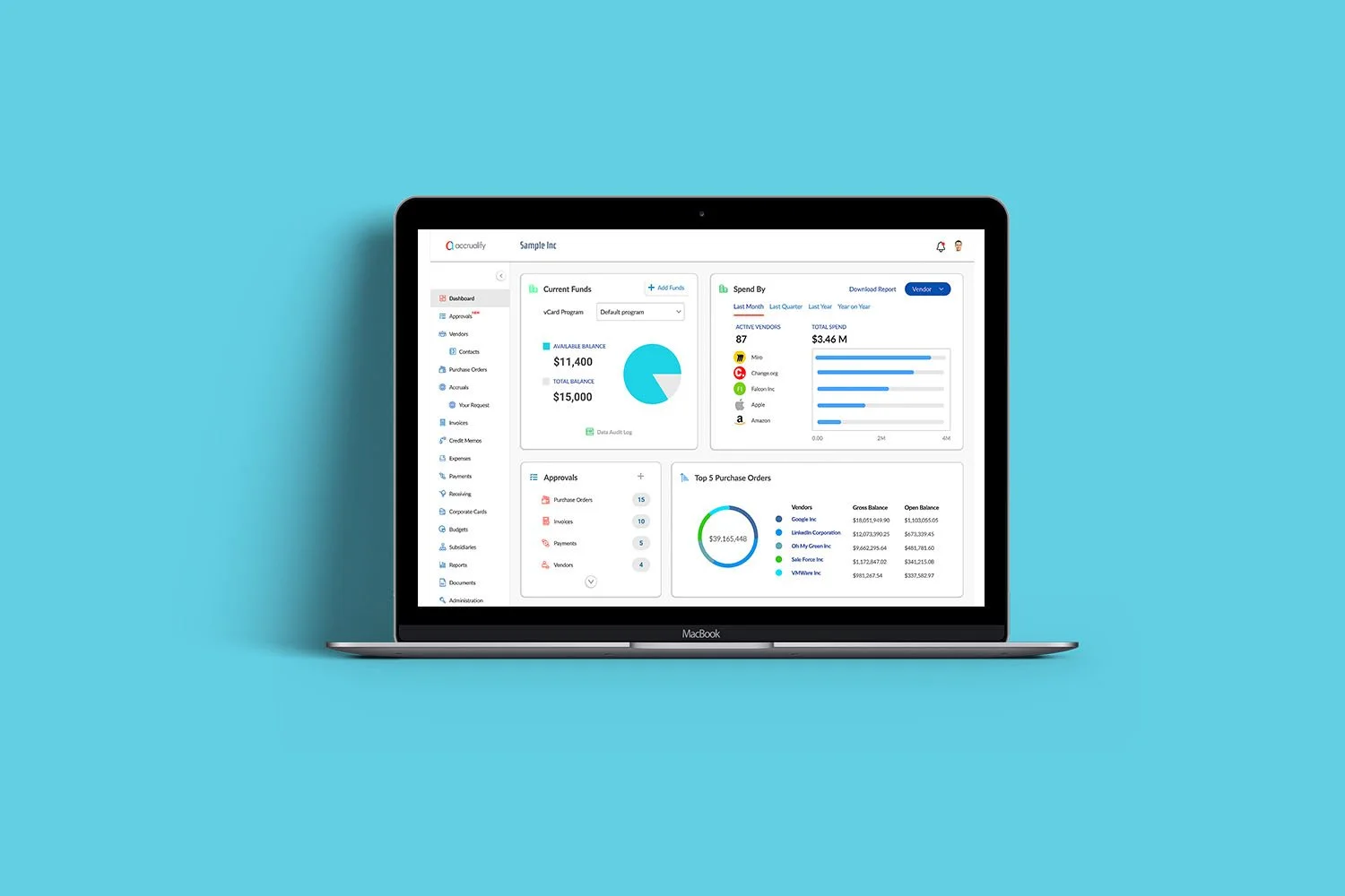
A one-stop application for efficient procure-to-pay spend management
Duration
June 2021 - April 2023
Role
Product & Design Lead
About Accrualify
Accrualify offers mid and enterprise level companies cloud-based automation solutions to manage their Procure-to-Pay and accounts payable processes better. Accrualify's products enable more efficient and automated management of purchase orders, accruals, invoices, payments, vendor management, and budgeting. Their mission is to leverage artificial intelligence (AI) and machine learning to address the many pain points corporate finance organizations face on a daily basis.
Web App ‘Refresh’
PROJECT DURATION
2.5 Months
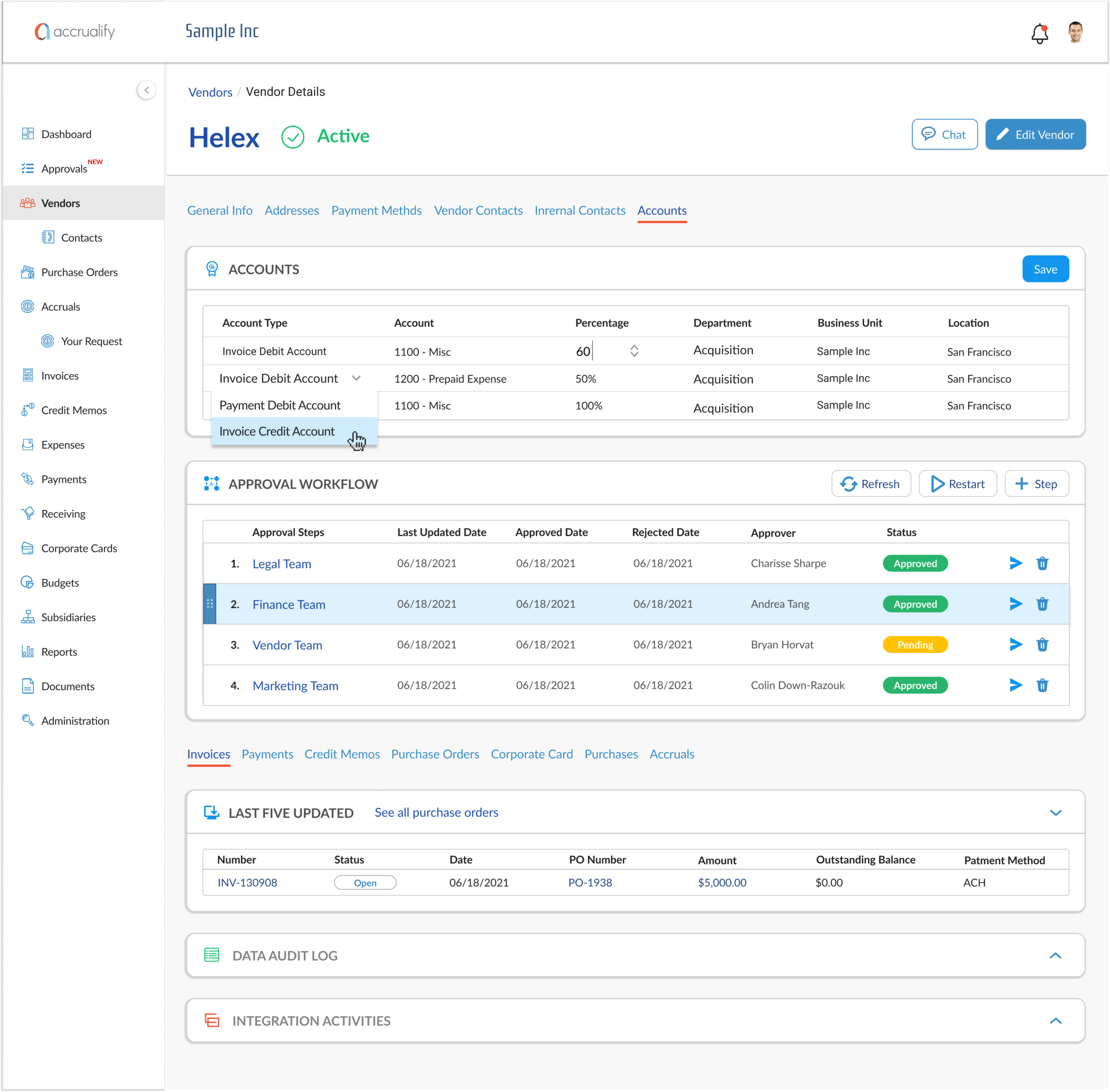
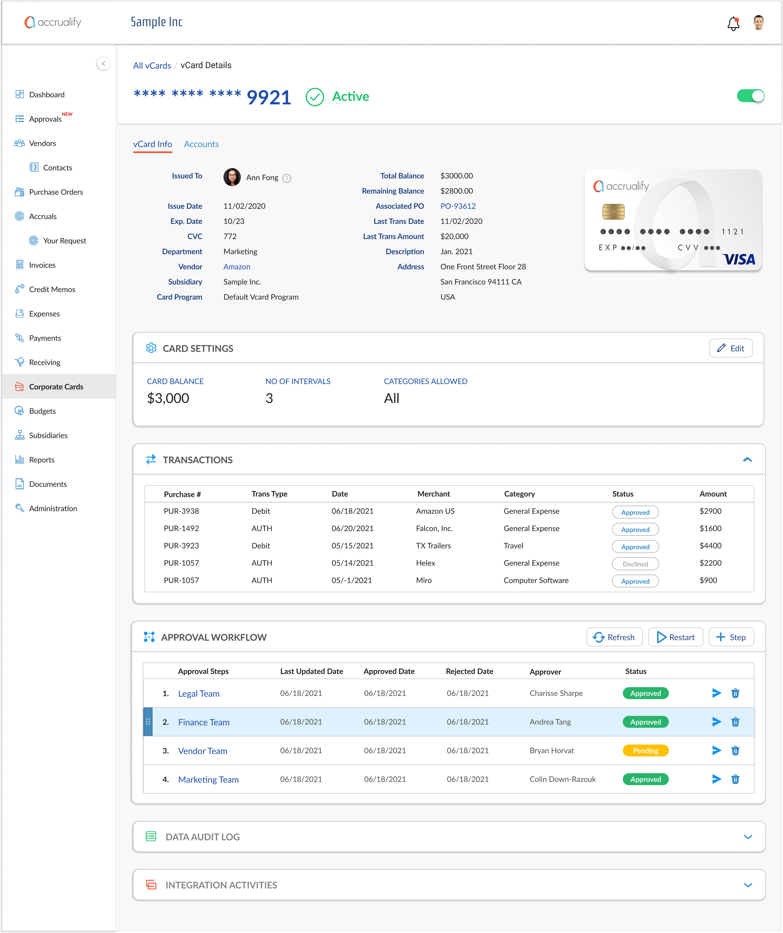
One of my first projects at Accrualify was to design a new theme for our web application (as part of the 'refresh' effort) and upgrade the user experience without embarking on a full-scale redesign (of the app) which could take months in time and resources.
As a startup, Accrualify practices lean development methodology with fast 2-week sprints. Each sprint has five stages:
Gathering business requirements
Allocating resources, design, and development
Testing
Releasing to our client base at the end of each sprint
The “refresh" project included setting up the Accrualify design library in Figma and creating key assets and screens for the new theme. During that time, I also did workshops with our bizops team (in the US) and our frontend engineering team (in India) to learn more about our product and create a checklist for the key targets to guide me in the design process.
Key
Improvements
Style
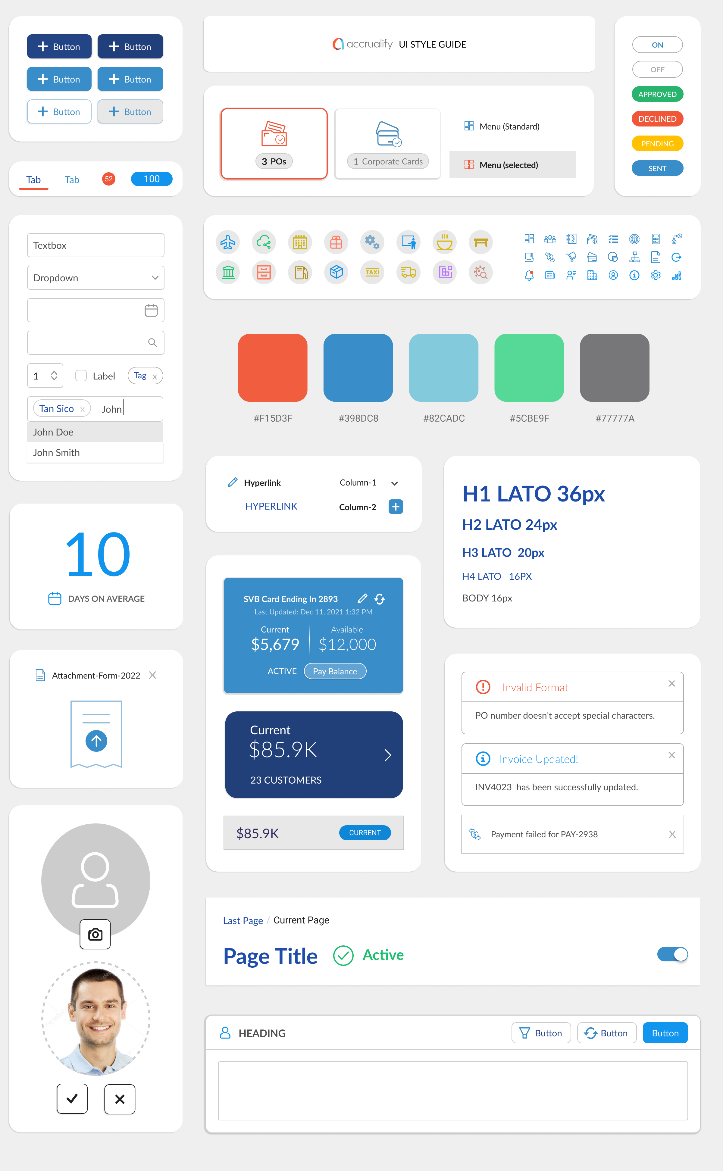
Choose a new default font for the app and create a typography style guide (Heading, Body, Navigation etc.)
Expand the existing color palette and ditch the "Purple"
Incorporate "white" as the foundation and add pops of color through vibrant UI components
UI
Design UI components (panels, form controls, iconography) to have softer rounded corners
Make effective use of the screen real estate across the app
Add icons where they can be substituted for text
Make grid more simplistic, remove alternating gray and white stripes and opt for lines or another approach to highlight rows
Scroll bars are non-functional - they really don't work!
Improve column editor on the grids as selecting data points don't currently stick
UX
Information Architecture: Simplify side navigation by consolidating "Approvals" menus into a new page. Add tabs (for each module) in the company settings for easier navigation.
Navigation: Establish a blueprint for primary buttons (Add, Bulk Actions, Quick Filters, Import / Export, etc) as they appear for both "sectional" and "detail" pages.
Fix inconsistencies: Sweep through the app and remove broken links, redundant buttons, and poorly designed forms. Look at all "NOLT" recommendations.
Unfortunately, we weren't able to hit all the targets under UX improvements, but overall the new theme provided a more consistent UX and was well received by the customers.
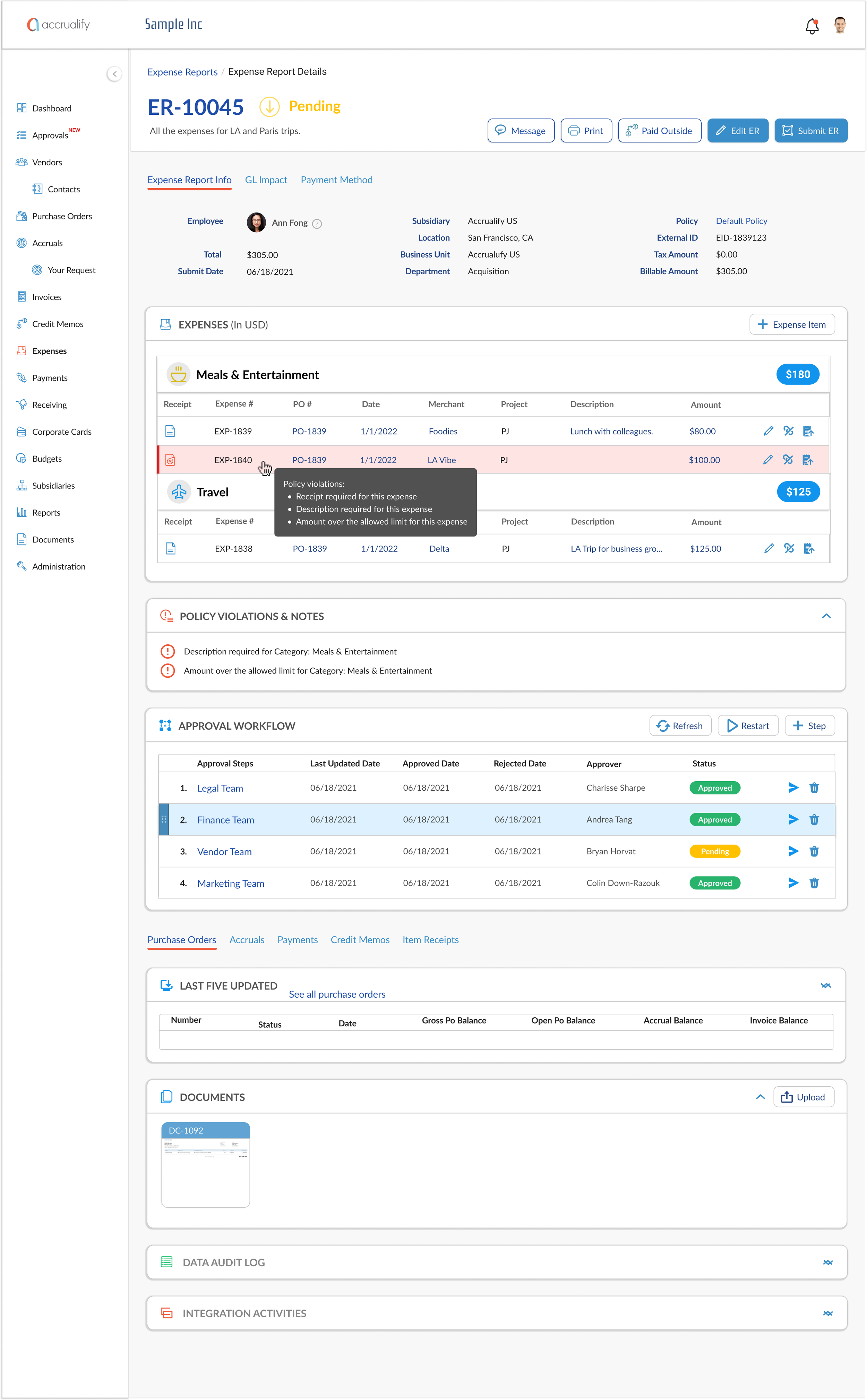
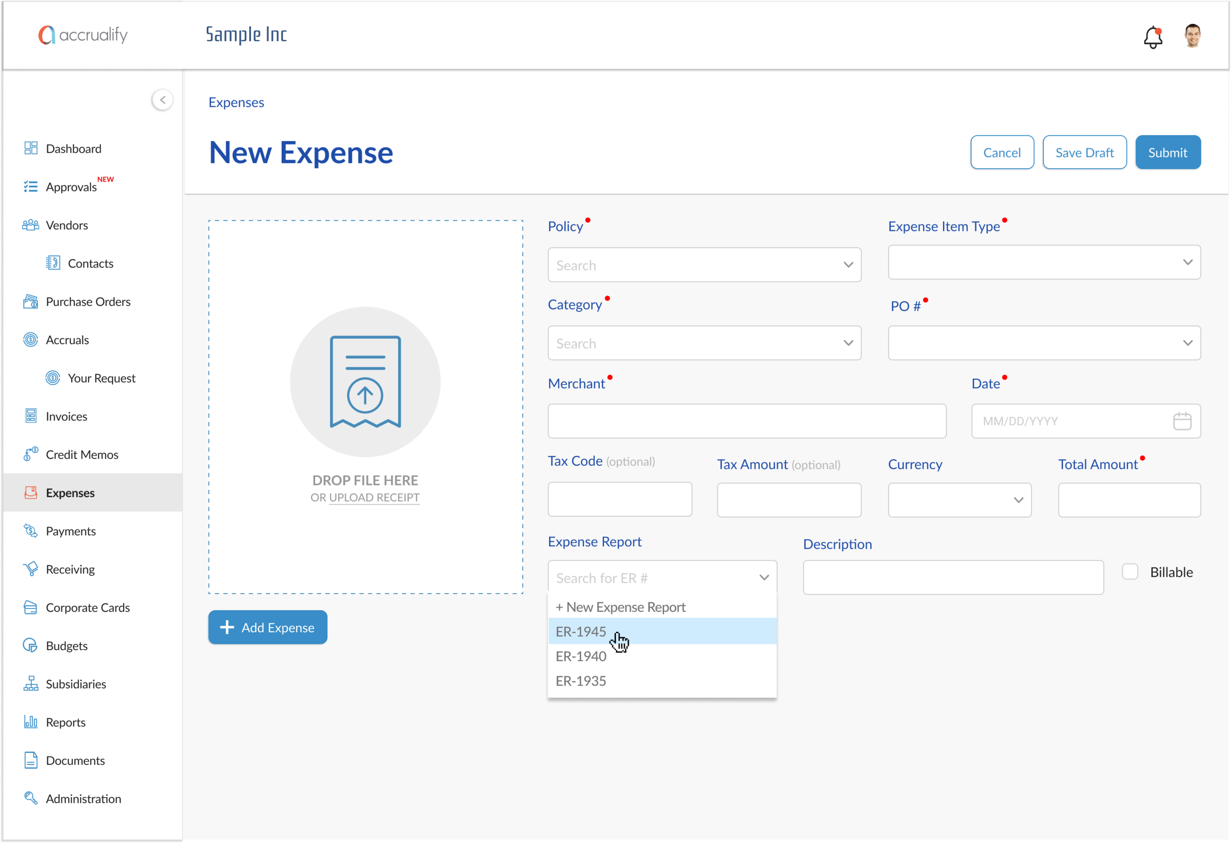
This is how the app previous looked,
And now, refreshed.
Mobile App 2.0
PROJECT DURATION
3 Months
Another cornerstone project for the bizops team was redesigning the mobile app. The current app was cumbersome to use and looked dated in its design. The team wanted the mobile app to deliver an engaging and efficient user experience that allows the users to seamlessly go back and forth between the web and the mobile devices while performing their daily tasks.
For example, most users prefer to use the mobile app to "create a new expense" because it's easier to upload receipts using their phone camera. Also, many managers like the ease of "Approving" new requests for Purchase Orders, Invoices, or vCards (Virtual Cards) directly from their mobile without having to access the web app.
Research
Accrualify's top competitors in the spend management market include the Expensify and the TripActions Liquid apps. Both of these apps provide a seamless expense management experience through a flexible and intuitive UX design. Before I started my overhaul of Accrualify's mobile app, I analyzed these competitors to learn more about the design direction they took while tackling similar themes.
From this analysis, I learned the following:
Competitors do seem to have a better UX than Accrualify, mostly due to its overall information architecture and interface design even though Accrualify is significantly more feature-rich the other platforms
There are various ways to reduce users' cognitive load, and some competitors do this very well. As the app's content is primarily text-based data (e.g., dollar amounts, percentages, dates, merchant names, finance terminologies, transaction IDs), we can simplify by prioritizing and emphasizing key information, moving details to a lower level of the hierarchy, representing text with iconography, representing numeric data with visuals, and presenting only a limited amount of information at once.
I recall thinking that the contrast between these apps and Accrualify was stark. I wanted to bring Accrualify out of the antiquated, monolithic, and difficult to use by:
Switching to a modern design and an intuitive UX (through revamping its information hierarchy and user flows).
Adding new features that provide bespoke insights for users based on analysis of their financial data to make the app more personalized
I also wanted to challenge myself in the design process by incorporating recent design trends, reducing text-heavy content and presenting work that the entire team can rally behind.
Taskflows for Mobile App 2.0
The design process involved white-boarding concepts and user flows and translating those directly into hi-fidelity designs. We relied on industry standard design patterns for mobile devices to nail down the XD.
These are the key improvements we set out to accomplish in the new design:
Ease of login: using SSO and facial recognition to allow for faster login process
New home screen to display snapshot of user stats
Improving expense management: Introducing manual and guided expense creation while efficiently handling any policy violations
Ability to create and manage virtual cards through digital wallet
Ability to request a purchase order
Ability to link external bank accounts (credit cards), import transactions and turn them into new expense automatically
Prototyping was the most effective way to gain meaningful feedback from the team, consensus from stakeholders, and approval from leadership. In addition, I was able to easily share my Figma prototype with the team to get instant validation and/or feedback.
New Product Features
PROJECT DURATION
1-2 Weeks (each)
During my time at Accrialify, I also worked on these notable new features for our web app. For some of them, the design and development work is still in progress.
Alerts
The #1 request from Accrualify user base was to introduce a central notification system in the app to reduce the frequency and reliance on email-based notifications. After gathering requirements from the stakeholders, I created a new alert menu (bell icon on top bar) with three tabs:
Notifications: Alerts for Approvals, Rejections (Invoice, PO, Vendor, vCard, etc.), Credit Card Issued, Payment Failed, and Receipt Required for CC payments.
Messages: Alerts for any new messages for the user on an associated Invoice or PO.
News. Alerts for new blog posts, articles, and product releases.
Approval Workflow
For this feature, Accrualify’s Bizops team wanted to reimagine how an approval workflow is created in our app. From a product design standpoint, my priority was to focus on making the penal intuitive for users so that they can build any complex workflow using steps and triggers. I also wanted to make it easy for users to drag-n-drop to adjust the order of the steps. The following triggers were included:
Amount
Subsidiary
Department
Location
Vendor
Account
Vendor requiring PO
Invoice without PO
The final design provided a much needed flexibility for managers to create and manage workflows.
External Accounts
With the growing list of companies using Accrualify, this was an important feature for making the application a one-stop-shop for Expense Reimbursement. It's an interface to connect users' external (bank) accounts, import transactions and code them either as A) new expense or B) match the transaction to an existing invoice or purchase order within the Accrualify platform. This made our users super happy!
Credit Memo (for Invoices)
This was a relatively small feature addition to allow users to apply credits to selected invoices and submit the outstanding final balance for payment.
As a product manager, working on a fintech application like Accrualify has been a great learning experience for me. I have gained a deeper appreciation of how spend management platforms work and their utility in helping finance managers.
Personally, Accrualify has been a growing experience for me to trust the design process and rely on effective communication to build trust in a team setting. I also noticed that I have a strong inclination for visual design, and learning about what makes a design truly great and accessible.

