A responsive e-commerce platform that provides personalized insurance policies for everyone.
Project Duration
4 weeks
Role
UX/UI Designer
01 Introduction
Company and project overview.
02 Research
Research methodologies, user persona and empathy map.
03 Define
Project goals, sitemap and user flows.
04 Design
Wireframes, branding, responsive UI design and testing.
05 Conclusion
Final thoughts and future direction.
01. Introduction
After successfully selling insurance to regional agents for 30 years, Kaus is looking to pivot their marketing strategy by offering direct to consumer sales through a new online platform. Kaus wants to tap into the digital market and fulfill the demands of a much younger consumer base. (Speculative Project)
The different stages in my design process included conducting user research, laying out information architecture, wireframing, branding, user interface design, prototyping, and usability testing.
02. Research
I began by setting up research goals to gain a better understanding of the problem and potential challenges in the context of user needs. More specifically:
1. Investigate how consumers are choosing their insurance providers
2. Develop an understanding of different plans offered by the competition
3. Figure out the needs of a younger generation of consumers and the first-time buyers
Who are the Competitors?
The first step was finding more about kaus’ competitors through Market & Competitive Analysis. I wanted to figure out the strengths and weaknesses of the major players in the industry.
Consumer Interviews
Next, I conducted consumer interviews with 4 participants to learn more about their experience finding and purchasing insurance policies online. These were the key findings from my interviews:
Pain Points & Frustrations
Finding coverage is tiresome and confusing
Complicated insurance jargon (terminology)
Lack of transparency
Long wait times on support calls
Wants & Needs
Straightforward quote process
Low & competitive pricing
Great customer service
Ease of use (tech-friendly platform)
Based on my findings, I created a user persona and an empathy map to help me further define the project requirements.
03. Define
Next I took my research findings to put together the key requirements for an MVP. I decided to focus mainly on three key screens.
High Level Requirements
Homepage: Features primary navigation, a global search that allow users to find specific insurance products and claims section with links to file and view a claim
Insurance Products Page: An organized list of all insurance products divided into different categories
Get a Quote Page: Forms to collect user’s information to provide a personalized quote for selected insurance type
Sitemap
It was important to Kaus to innovate on how the information was organized on their new site, so I used card sorting to come up with a viable site map
User Flows
Another critical element of information architecture is mapping how users would find and interact with the website: from the site discovery to finalizing the insurance purchase. To accomplish that, I created a few user flows to present how our persona would interact with Kaus's website.
04. Design
With project goals clearly defined and information architecture laid out, I rolled up my sleeves to create mid-fidelity wireframes after sketching out a few ideas.


Brand Redesign
Kaus wanted their key values (competitive, transparent and trustworthy) to reflect in their new logo and branding. I used this brief to design a style tile and UI kit as part of their new brand identity.
Designing the User Interface
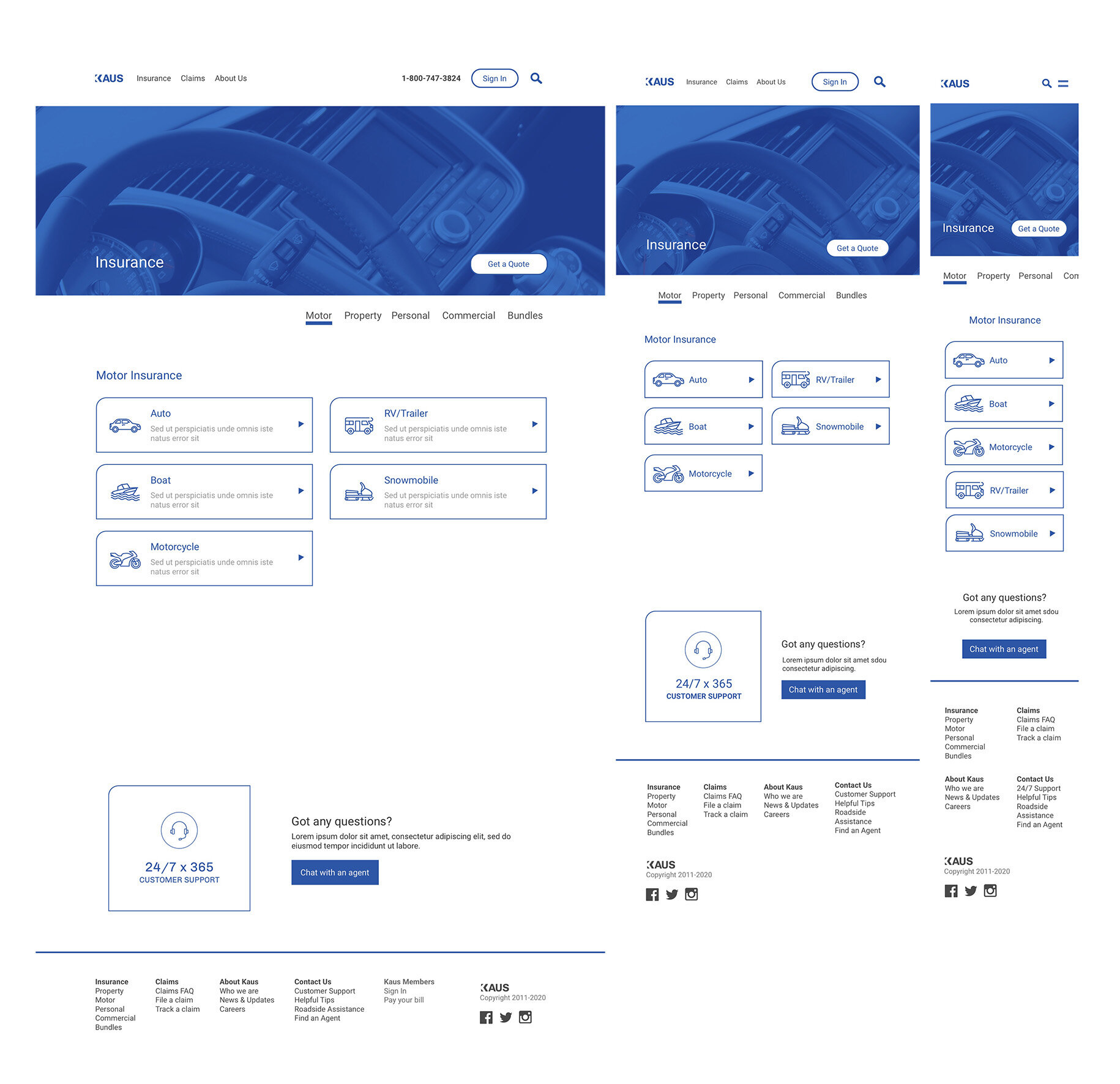
The last step in the visual design process is designing all of the individual pages using corresponding wireframes and branding elements. I then adapted them into a responsive design for desktop. tablet and phone.


Prototype & Testing
To get an idea of how well users would respond to the new site, I conducted a usability test of the prototype with 3 participants. They were asked to complete four tasks:
Task #1 Get a quote for car + renters insurance
Task #2 Edit your policy coverage details to adjust the quote
Task #3 Start a chat with an agent
Task #4 Finalize purchase and pay for car + renters insurance
Based on usability testing, I made an affinity map to prioritize the list of changes.
What Changed?
Homepage
Added primary insurance categories as icons (so users have access to them with a single click)
Added “chat with an agent” in top nav
Quotes Page
Added a comparison tool button to give users the ability to compare different policies and competitors offerings
Added a feature to display "savings" by the user on the quote page
05. Conclusion
While working on this project, I learned a lot about the insurance process and designing complex business models. I strived to create an efficient and streamlined approach for users to request quotes and find suitable coverage.
I am satisfied with the result of this project. But if I had more time, I would have developed a comparison tool to compare Kaus' quotes with their competitors.


